Diego García
Redesigning a training & resources website for users of a clinical research management system at Stanford University's School of Medicine
Background
As part of the the Stanford School of Medicine's communication efforts to increase adoption of the institution’s official clinical research management system, a training and resources website for users of this system was promoted. I proposed a redesign of the website in preparation for these communication efforts.
Summary of Process
Gathering Data
I started out by examining help ticket requests, compliance metrics, and quality control script data to identify areas of opportunity. In addition to reviewing these data, I also spoke with stakeholders, like business analysts and communications specialists who oversee the system, to gather insights from their perspectives around successes and challenges related to the website.
Insights
Themes that emerged from these data included:
Users were unclear about which steps are required for them to complete and which are optional.
Users were unclear about where to find necessary links & instructions for completing required steps.
Users were unaware of the benefits of using optional features available through the system.
Considerations
-
The redesign would need to support:
-
1.) prospective users visiting the website for the first time, 2.) frequent users of the system (use system weekly), as well as 3.) infrequent users (use system a few times per year).
-
-
The redesign needed to work within the constraints of the website template used by the organization.
-
The redesign could not be too time-intensive for the coding specialist juggling other tasks.
Recommendations
With these insights and considerations in mind, I reviewed the existing website and arrived at the following recommendations:
-
The information should be reorganized to better support both new and existing users.
-
Required steps should be outlined in a manner that spells out what is expected of users by the institution.
-
Optional features should be presented separately from the required steps and details on their benefits should be succinctly communicated to encourage adoption of these features.
-
To reduce clutter on the page, video resources and documents can be placed on a separate libraries page that the main page links to.
-
Visual elements, like the color palette, should be consistent throughout the website.


I reviewed the existing website & included comments to help guide my discussion with colleagues. A PDF of the before website can be seen here.
Sketch and Mockup
I then sketched a proposed new website. To review with my colleagues, I created a mock-up using a Google Doc. I also created and edited visual design elements, like buttons and icons, using Figma and Photoshop. The main mockup to share with my colleagues was created using a Google Doc to allow all team members to collaborate on suggested changes before implementing the redesign.


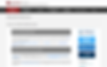
I started out with a simple sketch (left) to outline how information would be structured and then created a Google Doc mockup (right) to add additional visual details and content before reviewing with colleagues.
I presented the redesign recommendations and mockup to two other team members. They provided feedback and we collaboratively made changes to the mockup during team meetings. I then tested the mockup with a few colleagues outside of our team to gather some insights on usability, structure of information, and general feedback. I incorporated these suggestions into the final mockup and handed it over to a colleague who worked on the code and published the proposed changes.

I provided the coder a finalized mockup that included the specifications for the website updates to publish for users of the system. A PDF of the final mockup can be seen here.
Usability Testing
To test the usability of the updated website, I conducted remote usability testing over Zoom with 5 participants. The participants are current users of the research management system the website focuses on. The participants were seeing the redesigned website for the first time. Participants shared their screens and were asked to think aloud while completing a few tasks on the new website. Participants were also provided time at the end of usability testing sessions to provide feedback.